Sometimes, even to those of us who are creative, the art of creativity can seem a bit like a dark art.
I thought I’d take you through how I approach creativity and inspiration and how I translate it to something tangible.
There’s lots of clichés out there about creativity and inspiration, and some of them resonate with me while other approaches yield more for me.
One of the clichés we’ve all heard is ‘inspiration strikes, but it has to find you working’. There’s definite proof in there for my creative practice. Because inspiration can indeed strike at any time, however unless you are in a physical and mental place to do something with it, it’s wasted.
Finding inspiration
Inspiration, for me, comes from both the tangible and the intangible. A colour I see somewhere can weave itself through my artwork. A shape can resonate and I seek to incorporate the shape, or to break it down as an abstract element within my artwork.
Sometimes it’s a theme, or a group of images I use as inspiration. Or it might be a concept. In both my art and my poetry there’s certainly ideas I wrestle with and seek to express through my creativity.
The blue meanies was a recent series I explored, about how depression and anxiety manifest in my life and can overwhelm the good moments, the good intentions and create an excess of emotion scrambling my ability to deal well with life.
Below I take you through how I use this inspiration and translate it into finished art.
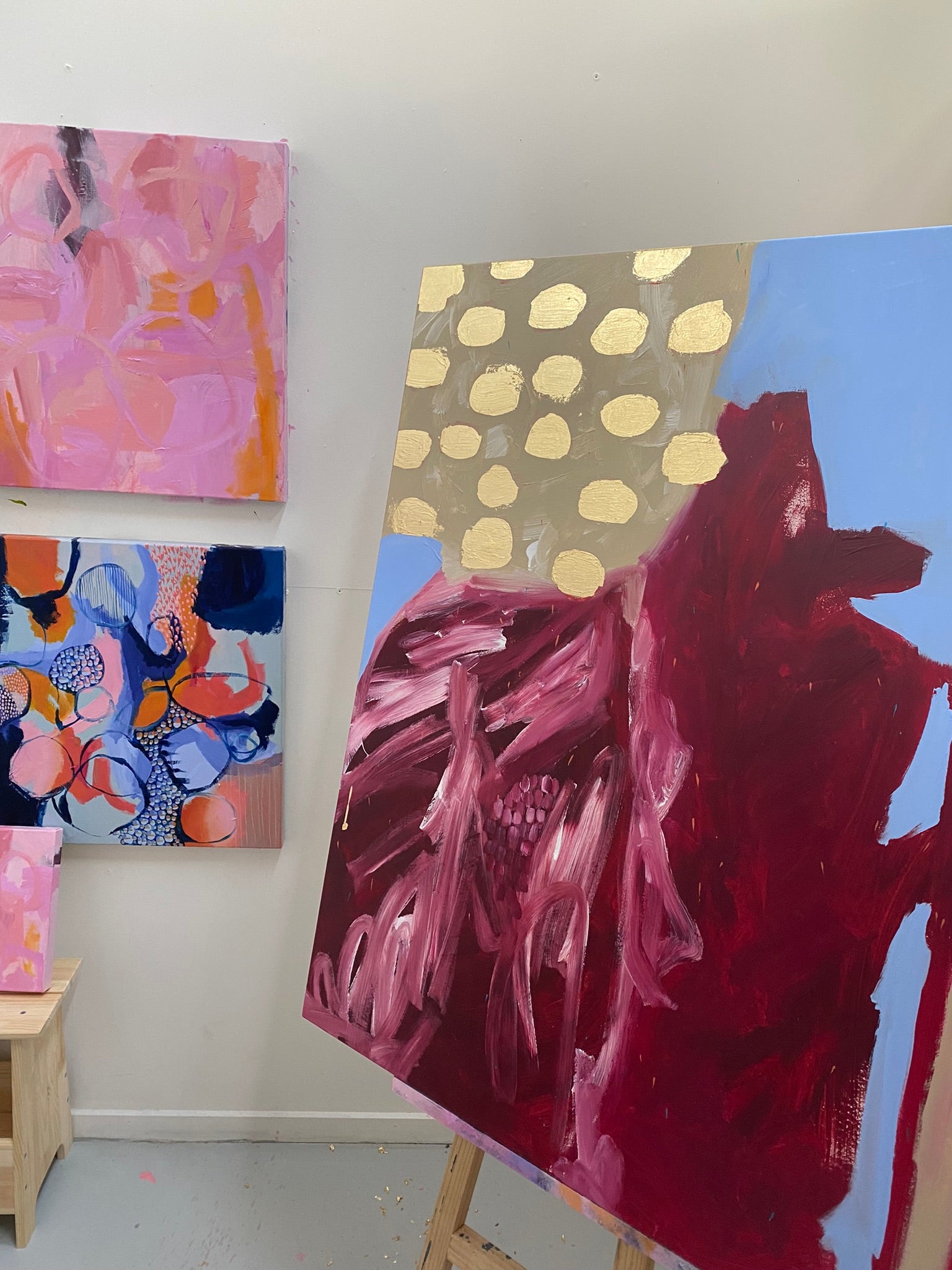
Deconstructing an element - dahlias

When approaching a new artwork, or a series, I find I work well when taking something very real and very tangible and then deconstructing it.
For my style of abstract expressionism (or mostly abstract), I want the viewer to feel something even without knowing what inspired the piece they are looking at. And perhaps, when they realise what inspired it, they take the time to look afresh at what is there, through the lens of the element. And perhaps they might see the inspiration, not just the result.
It’s ok even if they don’t - I appreciate they’ve taken the time to review the interpretation and the inspiration. Abstract art isn’t for everyone ;)
When I am I look for the key shapes and colours and lines. I seek the essence of element, and look to distil it in new ways.
An example is the series I have started recently, inspired by dahlias.

I could wax lyrical for many days on the magic of dahlias, but if I were to summarise the impact, I am in awe of the detailed symmetry of dahlias. The detailed petals, how tightly they form buds and then unfurl is a delight. And then the colours. Oh my. Bless all the gardeners and nurseries and breeders out there creating ever-new mixes of colours and tints and tones and shades and variants.
I love what Erin has created at Floret, and has an extraordinary range of dahlias <link>. Her willingness to share her craft on Instagram provides me with daily inspiration, of more than dahlias.
But I digress.
For the current paintings I am working on, I have used the base of a crisp blue sky. It speaks of summer and long days, and allows me to bring the other colours to life.

The curved shape of the many petals is captured, and the big pom-pom impact of a dahlia is also present. A big block of colour, smacking you between the eyes. And then the ever-present stakes supporting the dahlias are also captured.


I’ve chosen to represent the tiny petals as they are tight in the bud in the form of little flicks throughout the painting. And the sun, making it all possible is captured in the gold leaf.
Conveying a feeling - spring
I understand spring is a season, but to many people the time of year, the season, is also a feeling. It is the emergence of our psyches from the cold and the cocooning of winter. It’s the time when we plan to do more, to change up our expectations of ourselves and our environment.
Flowers start to emerge from the ground, from tight buds, from their waiting. As do we.
Spring is the feeling of hope - of new growth emerging, of tree lines changing amidst the weight of new blossoms, of colour returning to the world.
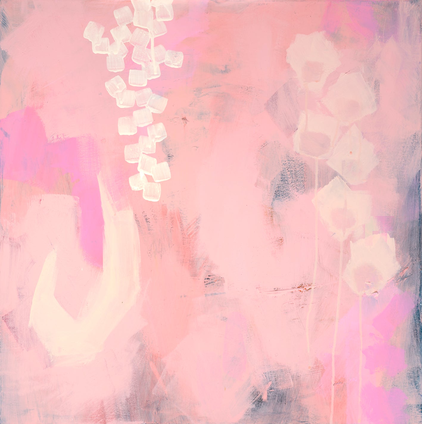
And it’s this feeling I aimed to capture in my ‘Spring’ series. The feeling of freshness and hope. The feeling of possibility unfurling beneath our feet.


I pulled together a mood board of flowers and gardens and then pulled together a colour palette. I used a lot of pink in it - it had a lightness about it, and that was the feeling I wanted to convey.

And then I used shapes reminiscent of flowers, petals and leaves to create a more overt 'spring' meaning.
But really, it's all about the feeling.
The lightness in the air.
The crisp mornings warming up to balmy days.
The freedom to dream of longer days and the delicious feeling of grass underfoot in the park.